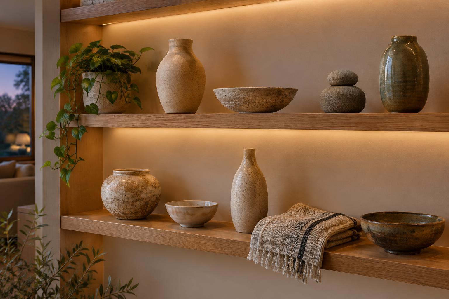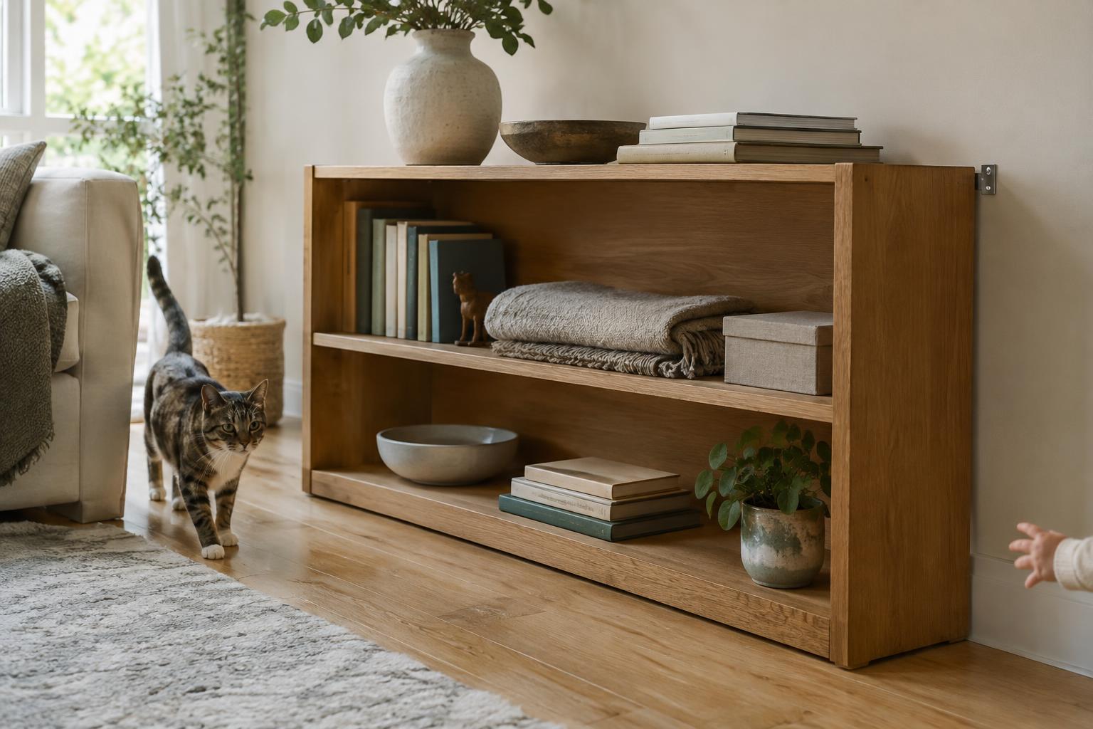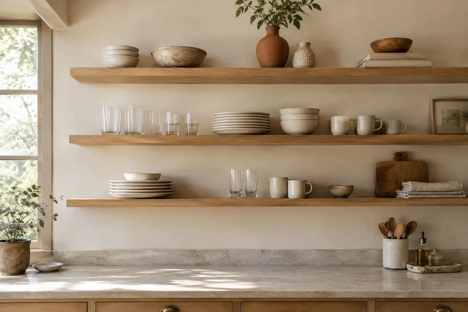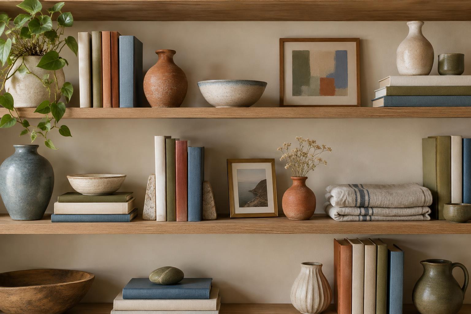
Start by Looking Beyond the Shelf
Before rearranging anything, gather a small selection of objects from around the room. Books, bowls, vases, framed pictures, boxes, and even a folded piece of fabric can contribute color. You are not deciding what deserves a permanent place yet; you are making the colors you own easier to see together.
Set the objects on a table in good light and notice which colors appear more than once. Look past an object’s most obvious feature. A patterned plate might have a narrow rust-colored border that relates to a book spine. A cream-colored pot might share the warm tone of a wooden frame. These quieter connections often make a display feel collected rather than strictly matched.
Include the shelf itself in this inventory. White paint, dark wood, and a colorful wall each act as a large area of color behind your objects. A palette that looks balanced on the table may feel different once it is placed against that background.
Choose a Small Palette with Room to Breathe
Pick one or two colors that are already well represented, then choose an accent you would like to notice in smaller amounts. For example, cream and brown might form the base, with muted blue as the accent. This is a guide, not a rule that every item must follow. Clear glass, natural fiber, and metal can often sit comfortably alongside a palette without becoming its focus.
Pay attention to the character of each color as well as its name. A dusty blue may relate more easily to weathered wood and matte pottery than a bright, glossy blue does. If two objects seem to clash, the difference may be in their intensity or finish rather than their basic hues. Try placing a neutral item between them before removing either one.
You do not need to hide every outlier. A treasured object in an unexpected color can give the shelf character. If it draws too much attention, move it away from the center, place it near a color that shares one of its details, or let it stand alone with some open space around it.
Repeat Colors Instead of Grouping All Matches Together
Once you have a working palette, spread its colors across the shelf. Placing every blue object in one cluster and every brown object in another can make the display look divided. A blue book on the left, a small blue detail near the middle, and a blue vase on the right give the eye a reason to travel across the arrangement.
Repetition does not require identical pieces. A pale blue illustration, a blue-glazed rim, and a deeper blue book spine can create a loose connection. Varying the size of these color moments also helps: let one object carry most of the accent while the others echo it more softly.
Consider the space between objects as part of the arrangement. An open stretch of shelf or wall gives colors a pause, especially when the objects have busy patterns. Rather than filling every gap, step back and see whether each group has enough room to be noticed.
Use Shape and Texture to Keep the Palette Lively
Color alone will not make a shelf feel balanced. If all the items of one color are tall and all the others are short, the arrangement may still feel lopsided. Mix vertical books with low bowls, or set a small object beside a taller frame. Try placing heavier-looking pieces lower down and using lighter or narrower pieces above them.
Texture can soften a palette that feels too orderly. A woven basket brings a different surface beside smooth ceramics; a matte box can calm a cluster of shiny objects. If you use fabric, such as a small folded textile beneath a bowl, make sure it sits securely and does not crowd the shelf. The aim is to add variety while keeping the colors easy to read.
Edit in Place, Then Live with It
Arrange the shelf, then look at it from the doorway or wherever you normally see it. Notice where your eye goes first. If one bright item pulls attention away from everything else, try moving it, pairing it with a quieter neighbor, or taking it off the shelf for now. Removing one object often does more than adding three.
Check the display at another time of day if you can. Light may make a warm neutral look cooler or cause a glazed surface to appear brighter. Make small changes rather than starting over: swap two books, shift a vase to another shelf, or leave more space around a patterned piece.
A cohesive palette should make your belongings feel connected, not make you reluctant to use them. Keep frequently handled items easy to reach, and leave room for a new find or a seasonal change. The most useful arrangement is one you can adjust without losing the color relationships that hold it together.