Choosing prints before looking at the room
A cushion may look appealing on its own but feel out of place beside a patterned rug, striped curtains or a busy piece of artwork. Before bringing in more textiles, look at the room from the doorway. Notice which patterns already draw attention and which colors appear across the larger surfaces. Cushions and throws do not have to match those elements, but they should have a relationship with them.
One approach is to choose an existing color as a starting point, then look for textiles that use it in different amounts. A cushion with a small accent of the rug’s blue, for example, can connect the two without repeating the rug’s design. If the room already has several prominent prints, leave some breathing space with a plain cushion or a throw that reads as a single color from a distance.
Using patterns that all demand the same attention
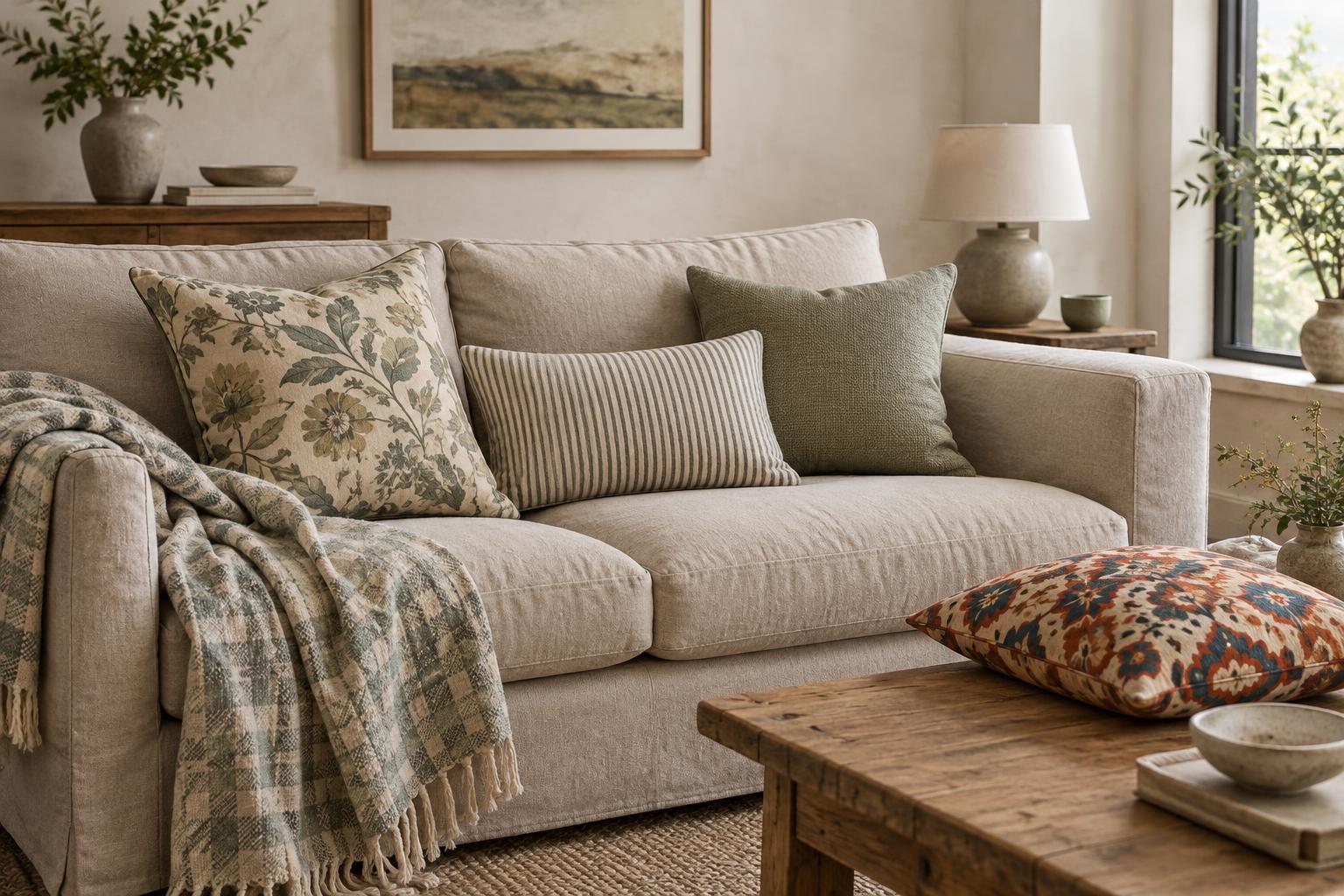
When every print has a similar-sized motif and a similarly strong contrast, the eye has little reason to settle anywhere. Three bold geometric cushions can compete even if their colors coordinate. Try varying the visual scale instead: pair a broad stripe or large botanical print with a smaller check, dot or fine-lined pattern. The difference helps each textile remain distinct.
Visual weight matters as much as the size of the motif. A dense dark print can feel stronger than a large pale one. Lay the fabrics together before arranging them and ask whether one can lead while the others support it. If they all seem equally loud, replace one with a quieter pattern or a solid. The aim is not a rigid formula; it is an arrangement that feels comfortable to look at from across the room as well as up close.
Mistaking a shared color for a complete plan
Buying every textile in exactly the same two colors may seem safe, yet it can make an arrangement feel repetitive. The opposite mistake is introducing a new accent color with every cushion. A more flexible plan gives the textiles a few points of connection without making them identical. One print might carry the main room color, another might repeat only a small accent, and a plain cushion can provide a pause between them.
Pay attention to the background colors of prints, too. A cream ground and a bright white ground can look noticeably different when placed side by side, particularly if the other colors are similar. That difference is not automatically a problem, but it helps to make it intentional. Spread your options on the sofa or bed in the light where they will be used rather than judging them only under shop lighting or from separate images.
Ignoring texture, weight and everyday use
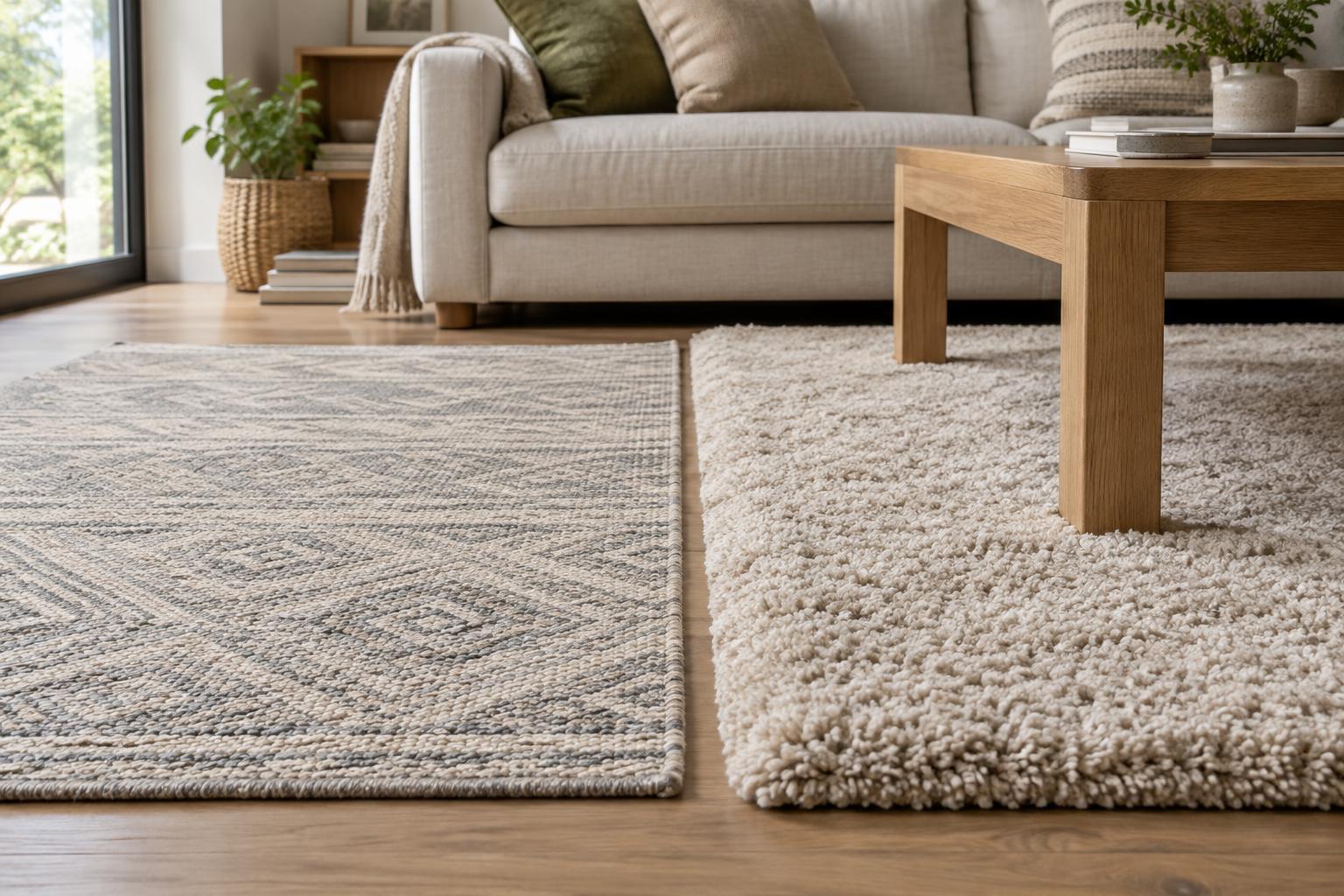
Pattern is not only printed. A ribbed knit, woven check or raised tufted design creates its own rhythm, even when it uses a single color. Combining several heavily textured pieces with several high-contrast prints can make a seating area feel crowded. A smoother fabric can offer a useful break, while a textured solid can add interest without introducing another obvious motif.
Think about how the textiles will be handled. A thick throw may look inviting draped across a chair but feel awkward folded between cushions on a small sofa. Delicate surfaces may be better suited to a decorative spot than the seat everyone uses daily. Check care labels before combining pieces that will need frequent cleaning. A successful arrangement should be pleasant to sit beside, move and maintain, not just pleasing in a photograph.
Adding more pieces instead of editing the arrangement
If a mix feels unfinished, another patterned cushion is not always the answer. First, move what you have. Place a strong print near a plain surface, separate similar patterns, or fold the throw so that less of its design is visible. Step back and check whether your eye moves around the arrangement or gets stuck on one crowded area.
Leave enough open space for the furniture to function. A sofa should still have room for people to sit, and a bed need not require a lengthy clearing routine each night. Try living with a smaller selection before adding anything else. Once the balance of pattern, color and texture feels right, the textiles can bring personality to the room without taking it over.