Start with the view from across the room
Before considering a clock’s finish or shape, decide where you will look at it from. A clock above a desk may only need to be clear at arm’s length; one facing a sofa or kitchen doorway needs a dial you can understand at a glance. If you are shopping in person, step back to roughly the distance you expect at home. When shopping from photographs, check the stated dimensions rather than relying on how large the clock looks beside staged objects.
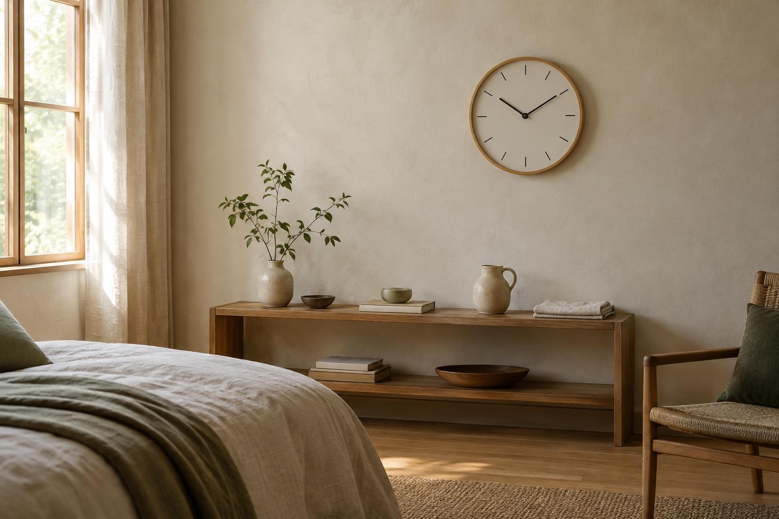
The most readable designs usually make the hour and minute hands easy to distinguish from each other and from the dial. Clear markers and strong contrast help: dark hands on a pale face, for example, are often easier to follow than hands in a similar tone to the background. Numerals are helpful when they are large enough to see, but a well-marked dial without numerals can work just as well. Be cautious with ornate hands that cross busy patterns; they may look appealing up close yet take longer to interpret from your usual seat.
Account for light, glare and the clock’s purpose
A clock’s readability can change throughout the day. Glossy covers may reflect a nearby window or lamp, hiding the hands at certain angles. A matte face or a different mounting position can help. If the room is dim, consider whether you actually need to read the time in low light. A clock that depends on subtle markings may be perfectly suitable in a bright living room but frustrating beside a bed.
Analog and digital clocks answer slightly different needs. An analog dial can be easy to take in quickly and may sit comfortably among artwork or ceramics. A digital display gives a direct number, but its brightness matters in a bedroom or a softly lit space. Look for adjustable brightness if you want a lit display near where you sleep. Whatever format you prefer, choose legibility for the person who will use the clock most, rather than treating the dial as decoration alone.
Listen beyond the word “silent”
Clock descriptions such as “silent” or “non-ticking” are useful starting points, not guarantees that a clock will be inaudible in your room. Some movements make a distinct sound each second; others move the second hand more continuously and may be less noticeable. An electronic display removes the sound of moving hands, though its other features may still make noise. Sensitivity varies, too: a sound lost in a busy kitchen can stand out in a quiet bedroom.
If you can examine a clock in person, listen close to it and then from a normal sitting distance in a reasonably quiet area. For an online purchase, look for a clear description of the movement and a return policy that gives you room to assess it at home. Check for added sounds such as alarms or hourly chimes, and make sure they can be turned off if you do not want them. These details matter more than a broad quietness label.
Consider what the room may amplify
Placement affects how noticeable a clock sounds. A hard shelf, a hollow cabinet or a wall shared with a sleeping area may make a faint mechanism seem more prominent. The simplest test is to set the clock temporarily where you intend to use it, then listen during the quietest part of your normal routine. You may find that moving it to another wall or away from the bedside is enough.
Make sure a wall clock hangs securely and sits flat so it does not rattle against its hook. A tabletop clock needs a stable surface where it will not be nudged while you reach for other objects. If the model uses batteries, check that the compartment is accessible in its chosen position. A beautiful clock becomes less convenient when changing a battery means dismantling an entire shelf arrangement.
Bring the clock into the room’s style
Once you have a readable, suitably quiet option, consider its role among the room’s other objects. A large clock can serve as a focal point above a console; a smaller one may work better as part of a shelf grouping. Leave enough open space around the dial that nearby frames, plants or stacked books do not obscure it. Repeating one material already present in the room, such as wood, painted metal or ceramic, can help the clock feel intentional without requiring everything to match.
The best choice is not necessarily the most striking clock on its own. It is the one you can read from where you need it, tolerate when the room is quiet and place without awkward compromises. Check those practical qualities first, then let the color, texture and shape add character.