Start with the shape, not just the color
When choosing a picture frame, it is easy to focus on black, oak or gold. The profile deserves just as much attention. It is the cross-sectional shape of the frame: the width of its face, the depth of its sides, and any slopes, curves or carved details between its outer edge and the artwork. Two frames in the same finish can have very different effects if one is a narrow, flat strip and the other has a broad, rounded face.
Begin by looking at the artwork from a few steps away. Notice whether its strongest qualities are fine detail, bold shape, soft color or a sense of texture. A frame can echo one of those qualities or provide a deliberate contrast. The aim is not to find a strict match for an art category, but to give the eye a comfortable transition from the wall to the image.
Match quiet profiles with detailed or contemporary work
A slim, flat profile often suits line drawings, graphic prints and photographs. Its simple edge gives the work a clear boundary without adding another pattern to read. For a small, intricate piece, try pairing a narrow frame with a generous mat. The open space lets the detail breathe while the frame remains visible enough to finish the presentation.
Contemporary abstract art can also work well in a clean profile, but consider the weight of the image. A print with large, saturated shapes may need a slightly wider face than a delicate sketch. If a narrow frame looks visually weak, a deeper box-like profile can add presence without adding ornament. Its side depth becomes especially noticeable when the piece is viewed from an angle.
Minimal does not always mean black. A pale wood or softly painted profile can maintain a simple outline while changing the mood. Compare samples beside the artwork rather than relying on a finish name: a warm wood may bring forward earthy colors, while a cool painted finish may sit more quietly beside blue or gray tones.
Use curves and ornament with intention
A rounded or gently sloped profile can soften the edges of watercolor paintings, botanical illustrations and other work with gradual changes in tone. The curve catches light differently from a flat face, adding a subtle decorative note. A narrow inner detail—a small ridge near the image, for example—can give the same work a more finished look without overwhelming it.
Ornate profiles can be effective with portraits, landscapes or decorative prints, particularly when the artwork has enough scale or visual complexity to hold its own. They can also create a lively contrast around simple art. Check that the frame’s most prominent details do not compete with the main subject. If your eye goes first to the frame and stays there, try a quieter carving, a narrower face or a less reflective finish.
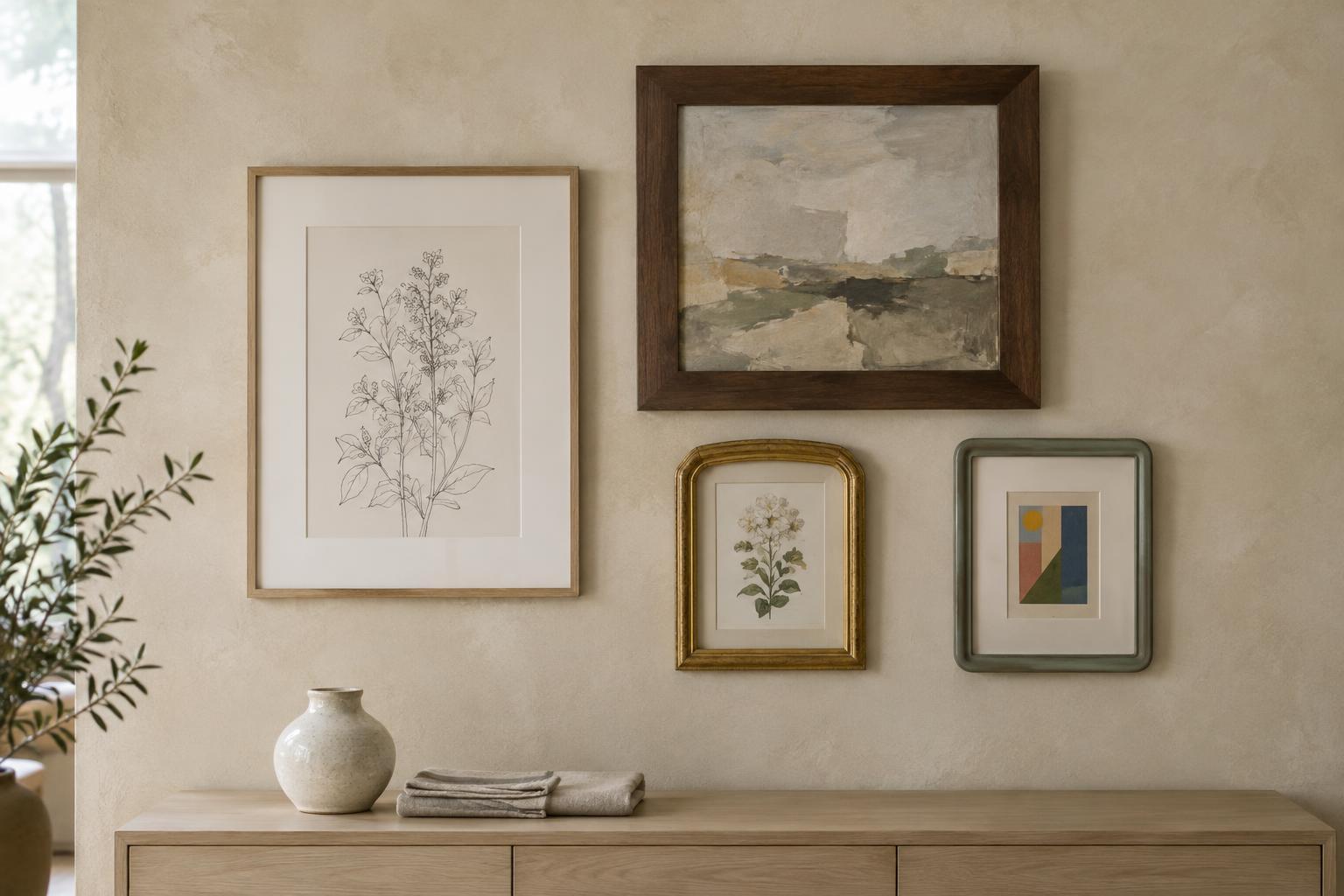
An older-looking artwork does not require an ornate frame, and a modern piece does not require a plain one. Treat style conventions as starting points. A restrained profile can make a traditional image feel fresh; a decorative frame can lend a small contemporary drawing the character of a collected object.
Balance width, mat and artwork size
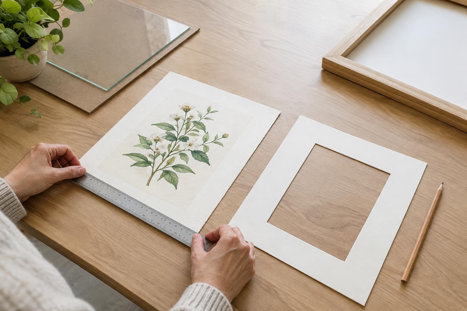
Frame width should be judged in relation to the whole presentation, not the artwork alone. A wide mat already creates distance between the image and the frame, so a modest profile may be enough. Without a mat, the frame sits directly beside the image and its shape and color become more prominent. Test both arrangements if possible, especially for works on paper.
For a small piece on a large wall, a mat and frame with some visual substance can help it feel intentional. For a large, busy work, a simpler profile may provide a welcome stopping point. These are visual guidelines rather than measurements: lay out paper strips to represent different widths, or hold frame samples against the art, then step back to judge the balance.
Remember to check depth as well as face width. Raised surfaces, textiles and other dimensional pieces need enough space inside the frame to avoid being pressed against the glazing. If the work needs specialist mounting or has particular preservation needs, seek advice from a qualified framer before choosing the final profile.
Make the frame work in the room
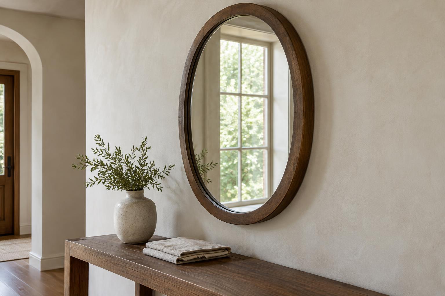
A frame belongs to an artwork, but it also becomes part of a shelf, gallery wall or tabletop arrangement. Look at nearby edges: furniture legs, mirrors, lamps and other frames. Repeating one quality—such as a slim outline or a warm finish—can make varied pieces feel connected. You do not need every profile to match. Mixing flat and gently curved frames can add depth when their finishes or proportions share a common thread.
Before committing, place the artwork where it will hang or stand and view it in the room’s usual light. Reflective finishes may become more noticeable there than they did on a sample table. A useful final test is to ask whether the frame helps you notice the artwork first, then rewards a closer look of its own. If it does, the profile is doing its job.